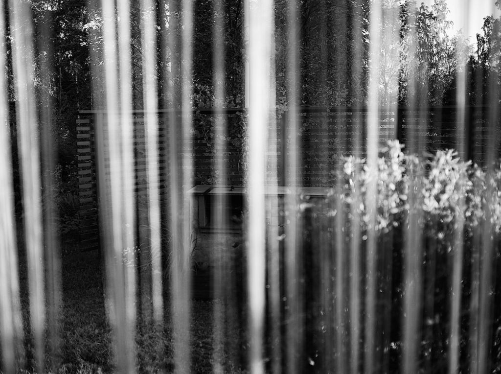
Composition is a subject that is discussed a lot in the field of photography, and rightly so. I taught evening classes in photography for many years, and here’s what I taught concerning composition.
I guess few of us are born with some innate ability to compose photos in a way that improves them, promotes the purpose of the photo, and makes them more interesting. Here I offer up a few principles you can apply to your photography. Don’t look at them as rules you have to follow, rather they should be inspiration to build on.
Leading lines
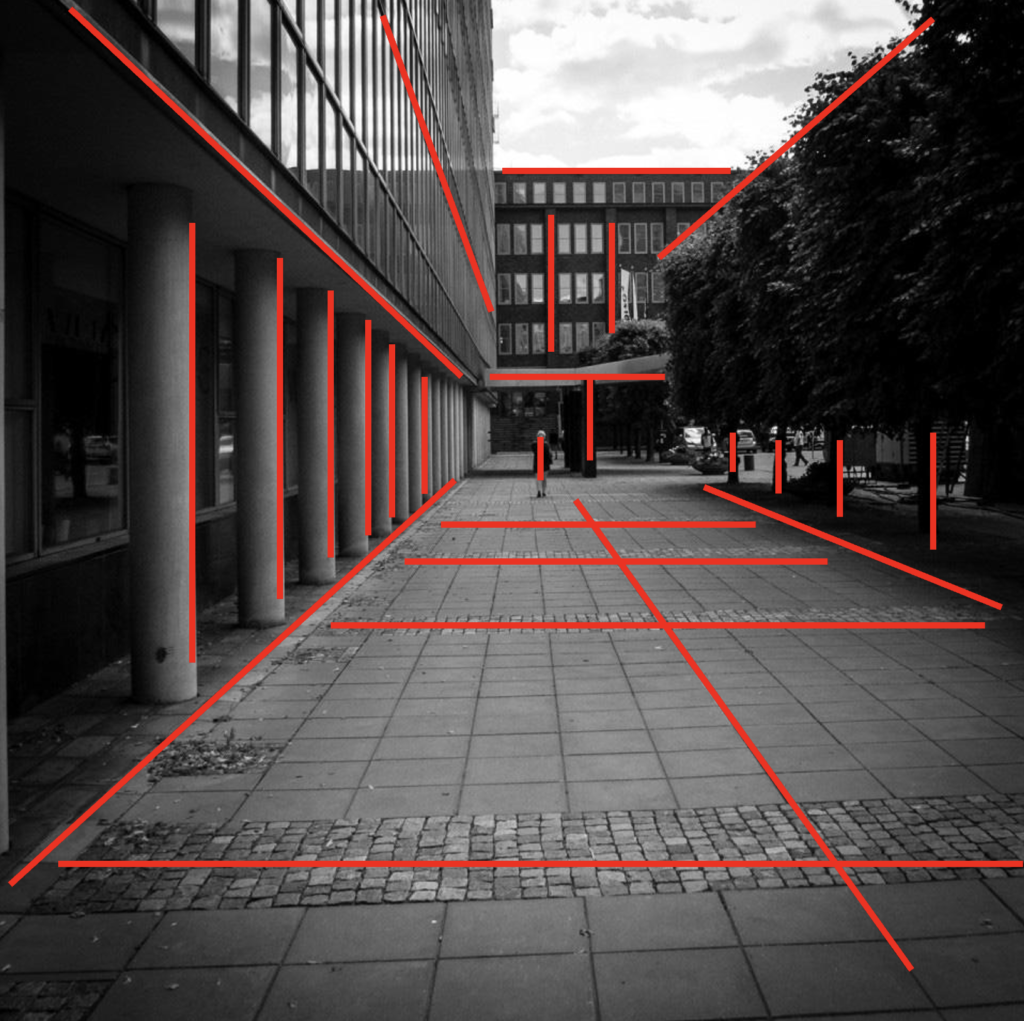
Lines is a simple way of getting interesting composition: parallell lines, diverging lines, converging lines, lines in depth etc. This is a photo I took one day on the way to work.
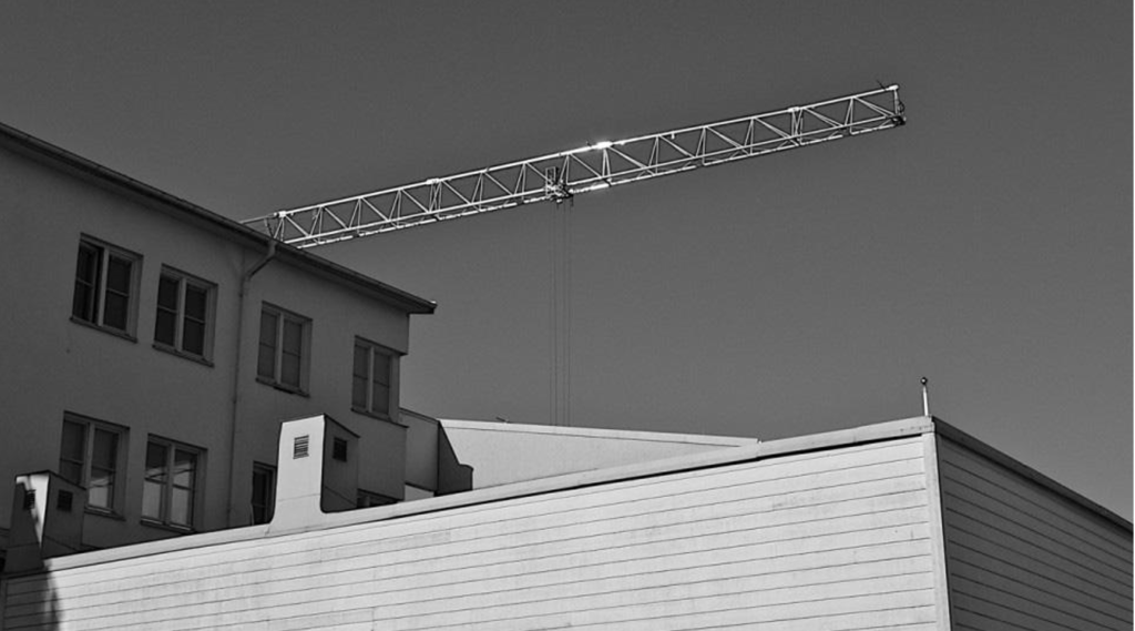
And here’s what I saw that caught my eye.
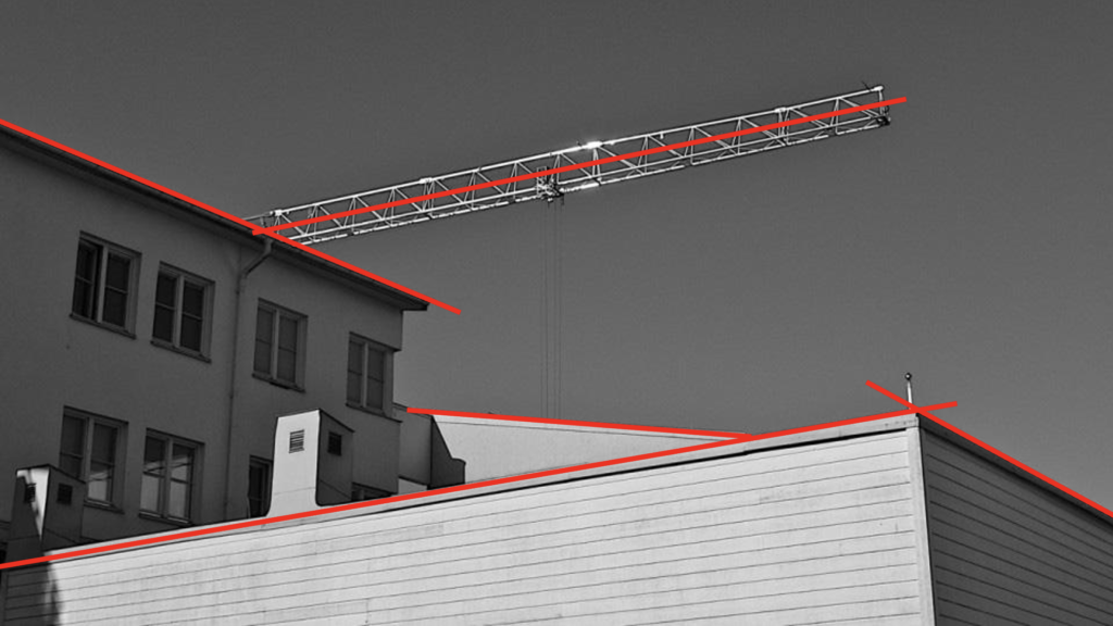
Another shot from where I used to work.
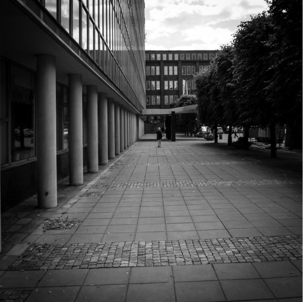
Many lines that create depth.
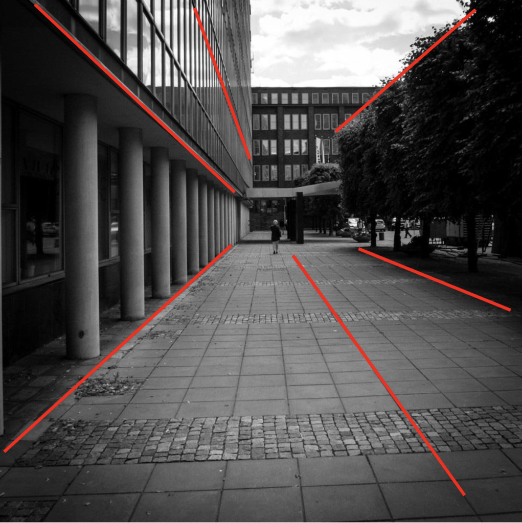
Even more linesl

And more.
Depth and movement
This photograph I shot sort of from the hip, but it turned out pretty well, if I say so myself.

And I think it works because there’s depth and movement in the frame.
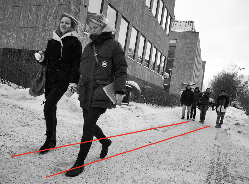
A bit of the same, although a very different photograph. There’s also repetition in this frame, which helps.
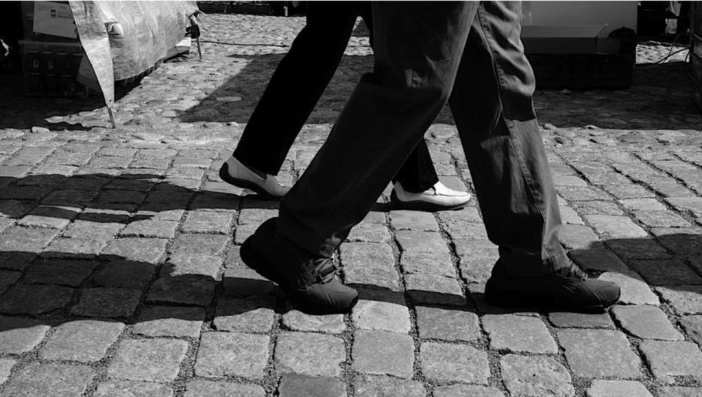

Repetition
I’ve mentioned repetition and here’s lots of repetition.
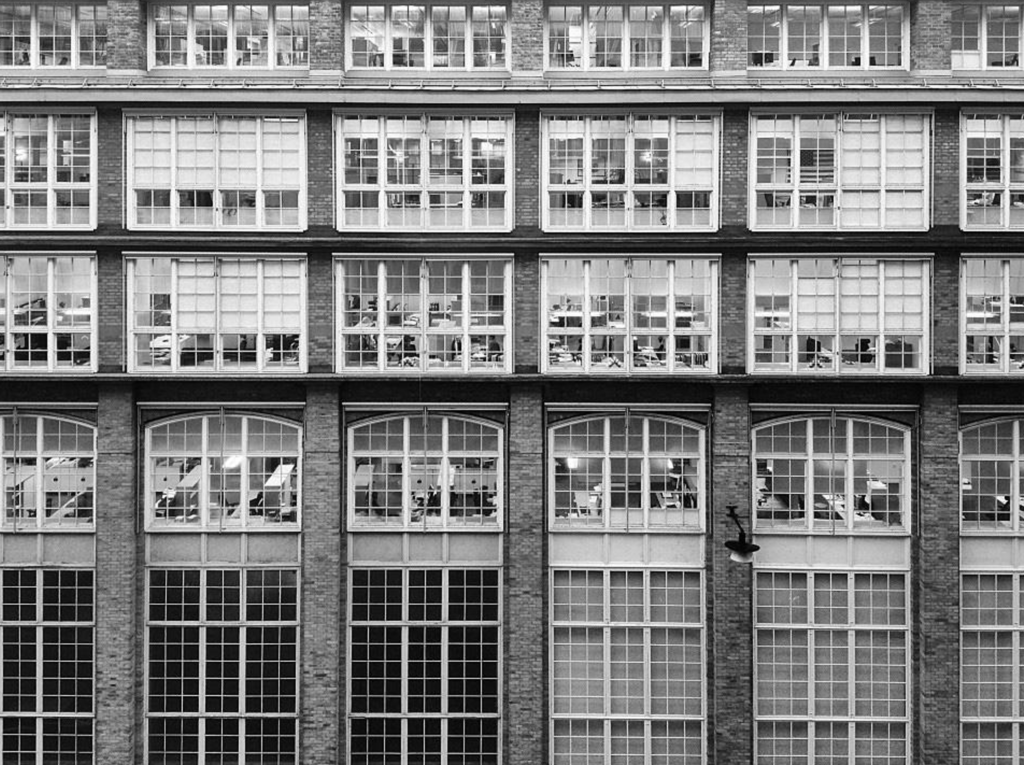
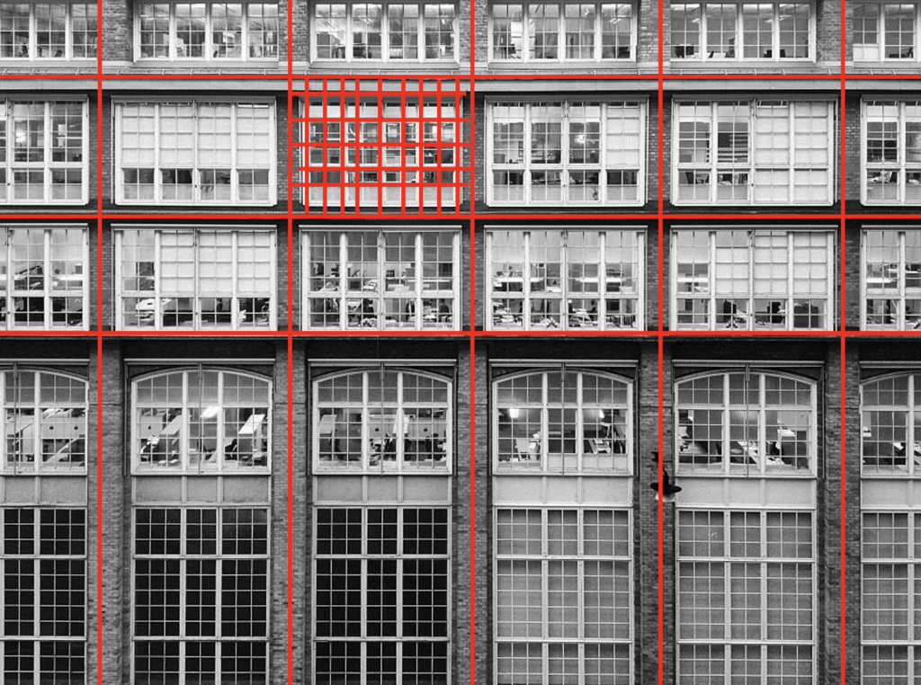
And more repetition, but also depth.


What’s not in the frame
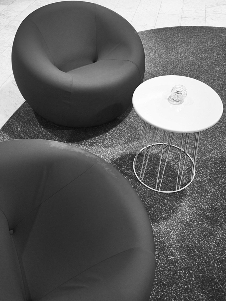
Sometimes what’s not in the frame helps create an interesting shot.

Rule of thirds
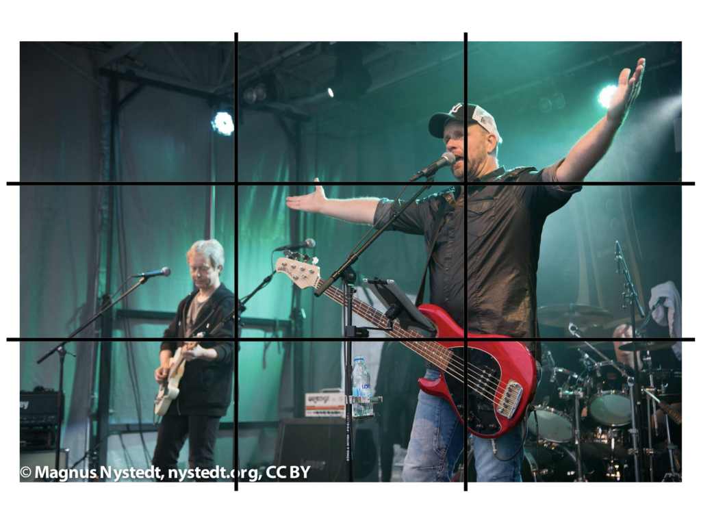
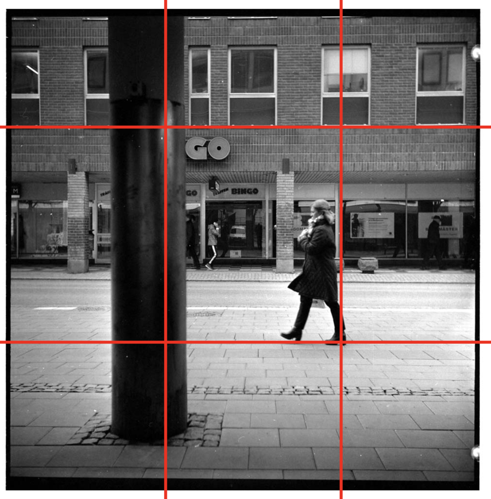
Rule of thirds (also known by other names) is the idea that you divide the frame into three equally sized parts, both vertically and horizontally. And what you want the viewer to focus on should be placed on one of the four intersections in the frame, marked by circles below.

Here’s, I think, a good example of what this means.
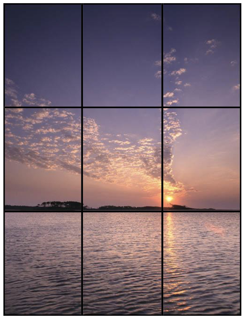
And it works just as well in portrait format.
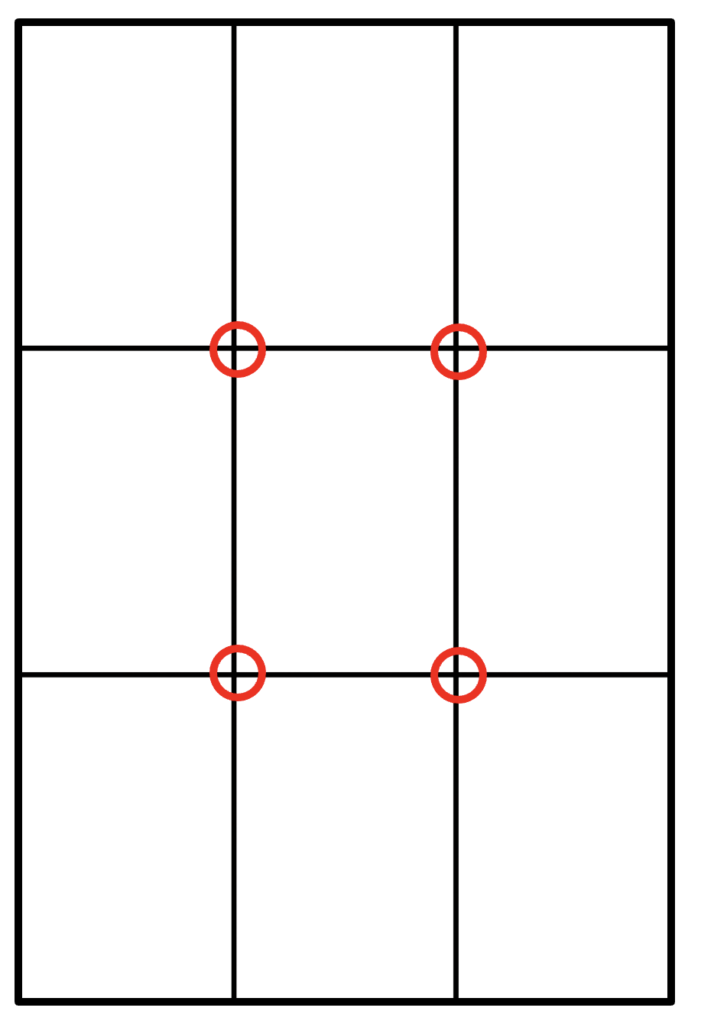
Like this.
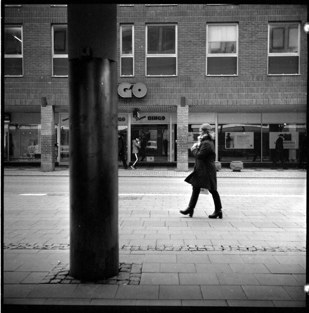
And in square format.
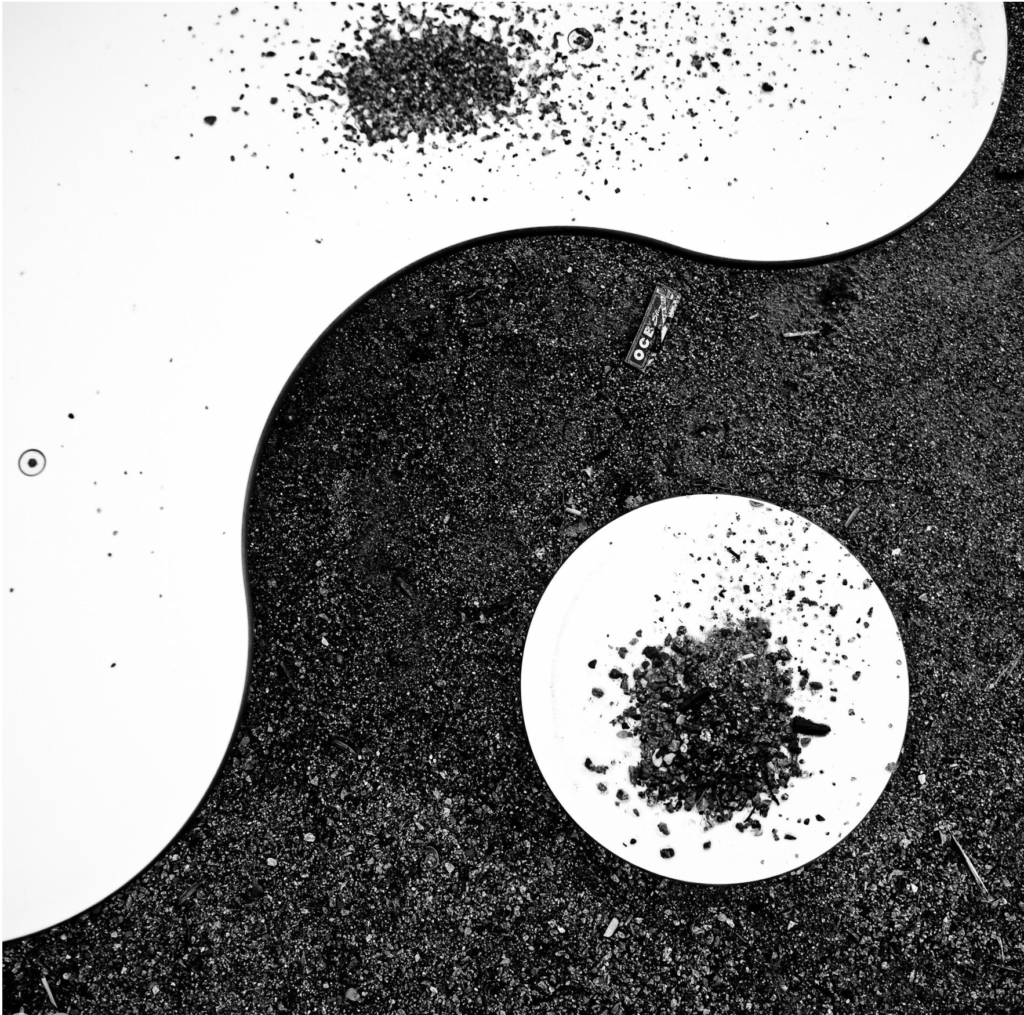
Like this.
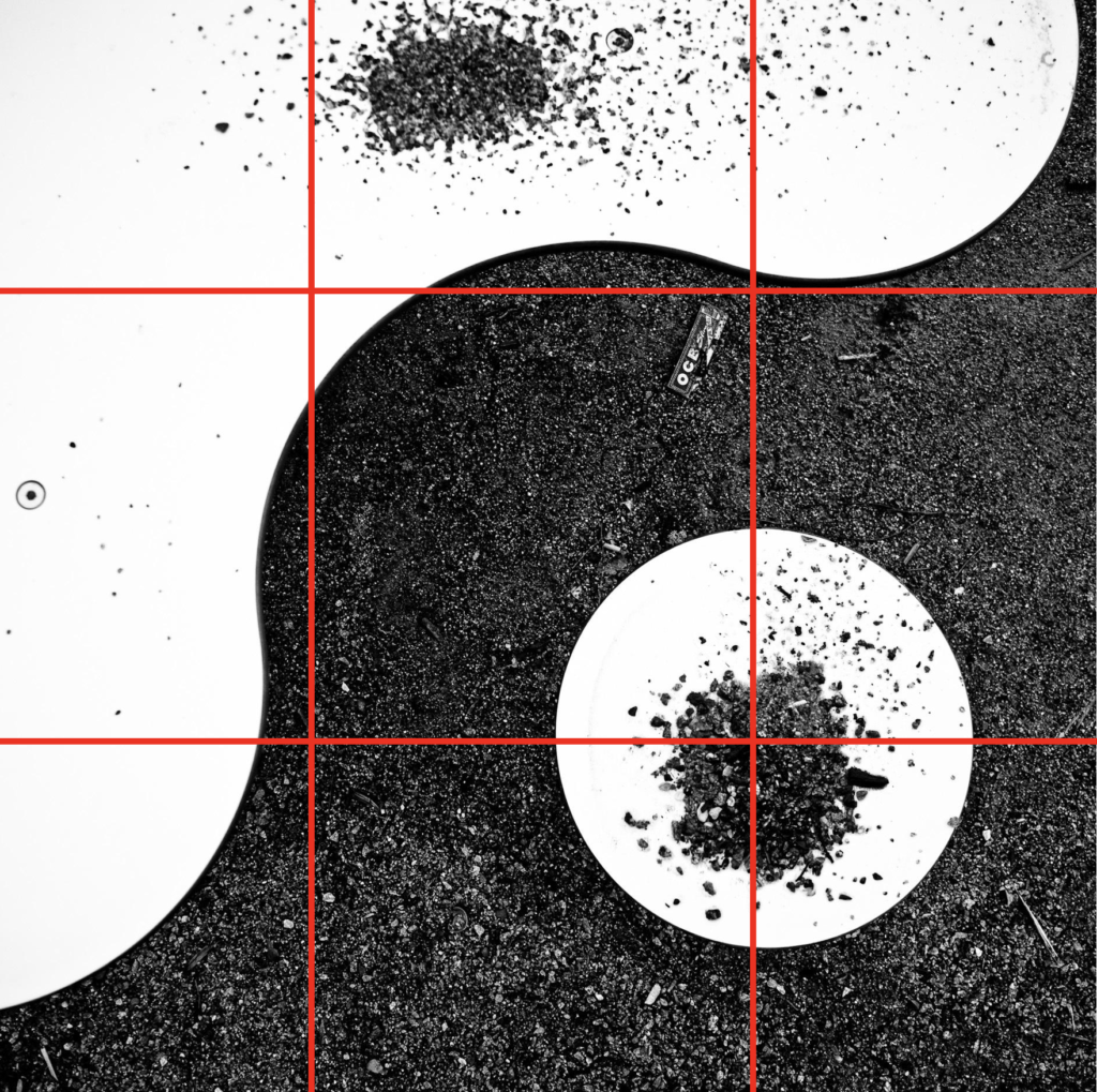
Another example.
For you to practice on
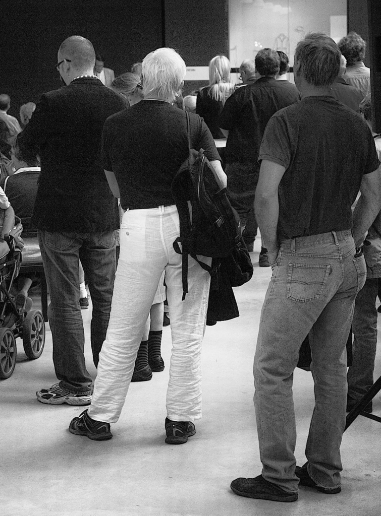
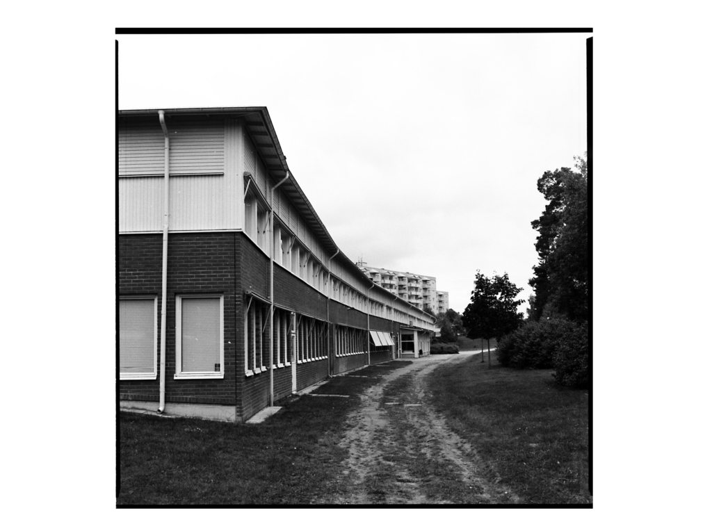
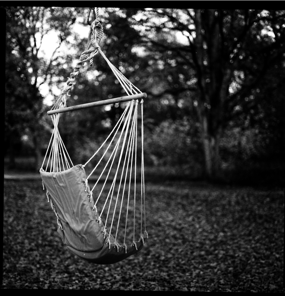
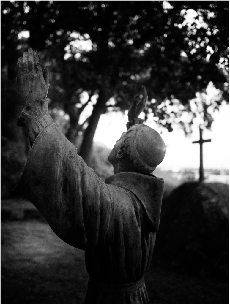
Here are a few more of my photographs. Take a look at them and think about what compositional elements do they have that make them work? Or do they break any compositional rules?
